The final campaign for the FIFA brand under its iconic name
FIFA 2023 – HALL OF FAME
THE BRAND
Hall of Fame was a campaign developed by Berlin-based creative agency GLÜCK for EA SPORTS to launch the final season of the iconic FIFA game series, marking its 30th release.
THE IDEA
As Creative Director at GLÜCK, I was involved in the creative development of the campaign, which launched alongside the release of FIFA 23 on September 30.
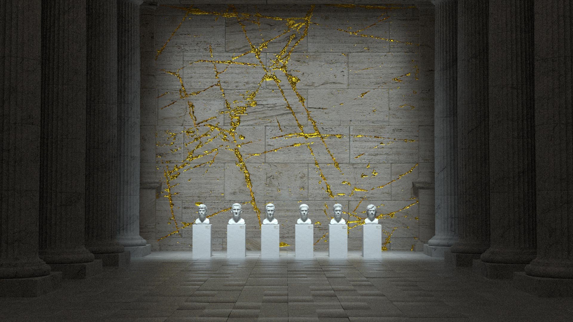
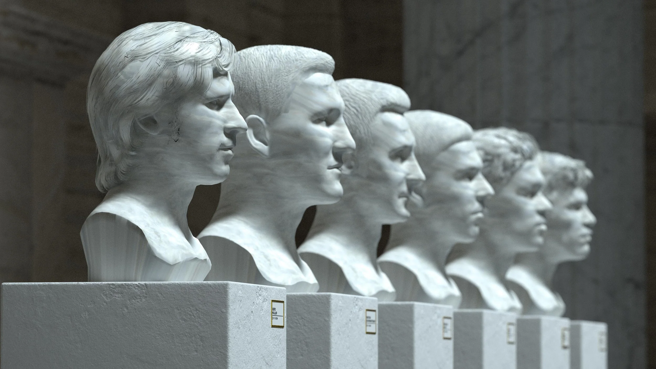
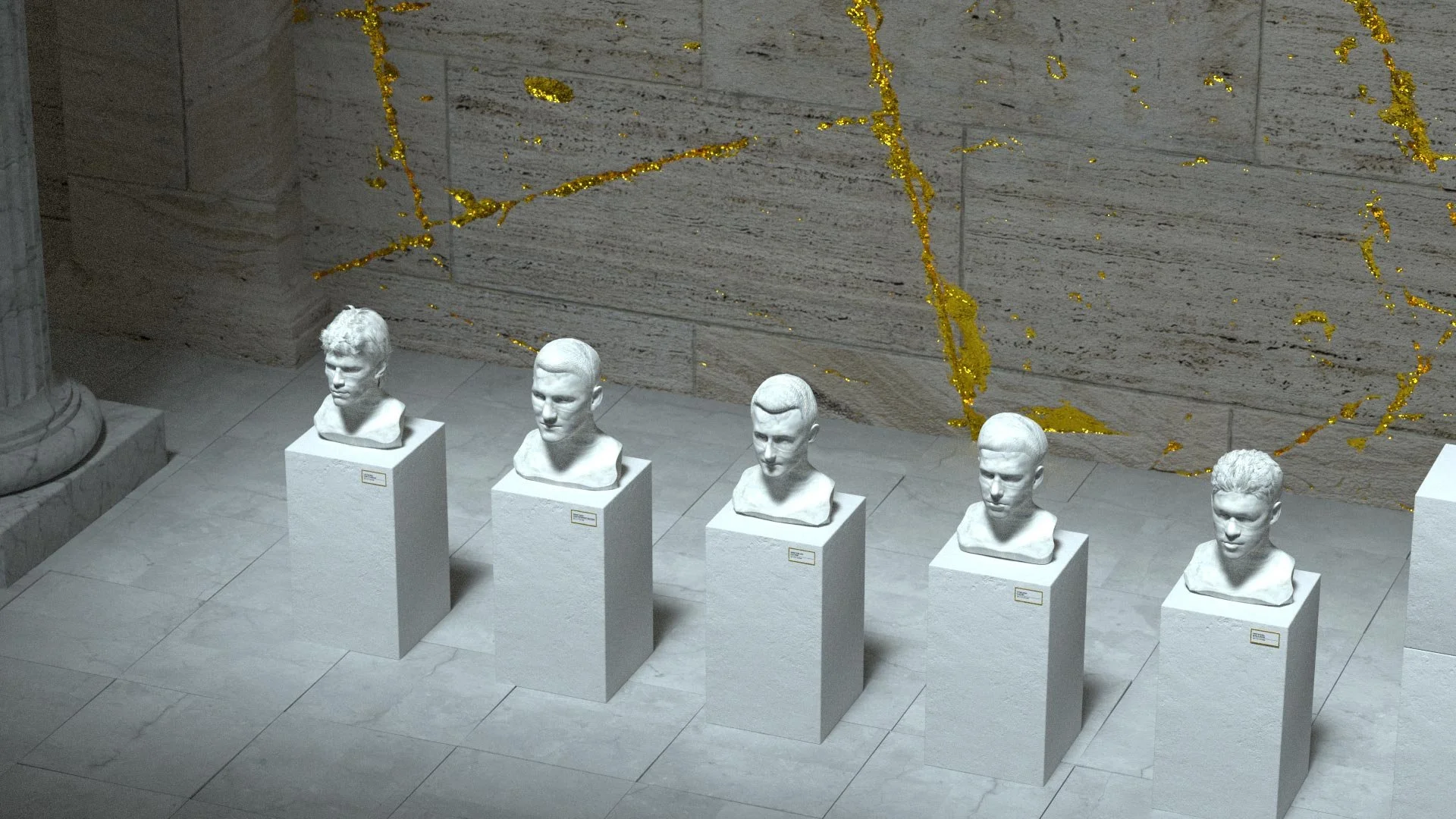
The campaign kicked off with a series of digital activations, led by a virtual Hall of Fame celebrating some of Germany’s greatest football legends: Bastian Schweinsteiger, Lothar Matthäus, Michael Ballack, Miroslav Klose, Philipp Lahm, and Gerd Müller.
The legends were reimagined as monumental 3D busts inside a virtual temple, creating a digital Hall of Fame that brought together generations of German football history.
The experience was directly connected to FIFA Ultimate Team, where the featured players could be unlocked as Icons and added to players’ teams, turning the campaign concept into an integral part of the game experience.
-
Creative Director
Integrated project for the American market
LUMINOUS DIAMONDS
THE BRAND
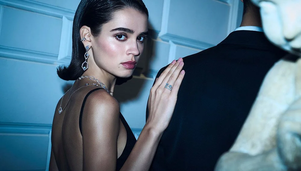
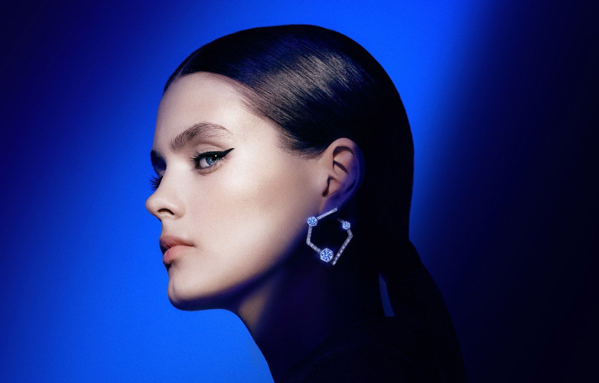
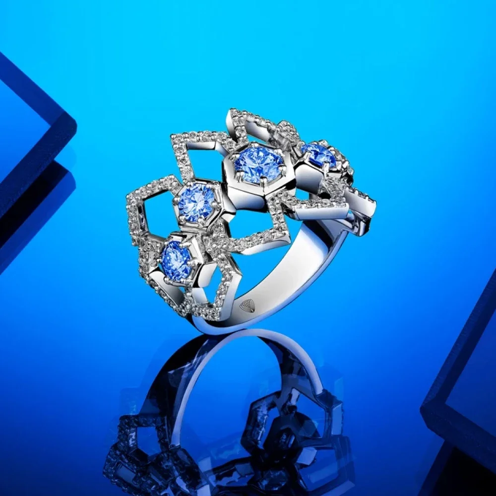
Fluorescence is a rare natural property of diamonds that makes them emit a subtle glow under UV light. ALROSA wanted to turn this distinctive characteristic into something more than a technical feature — and make it the defining idea behind the launch of its fluorescent diamond collection in the U.S.
THE IDEA
What if your inner light could shine?
I developed a campaign that transformed fluorescence into a metaphor for individuality, energy, and inner strength — positioning Luminous Diamonds as diamonds for people who have a light of their own.
The campaign was built around a narrative-driven commercial produced by New York-based studio Laundry Service, featuring seven influencers who shared their personal stories and what makes them stand out.
The film was supported by an educational animated video explaining the science behind fluorescence and an interactive WebGL-powered website that allowed users to explore the collection and discover the phenomenon for themselves.
THE RESULT
The limited collection launched in leading U.S. jewelry boutiques, including Neiman Marcus, Wilson & Son Jewelers, and Lux Bond & Green Jewelers.
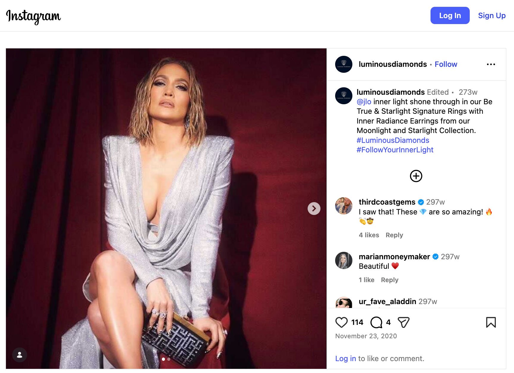
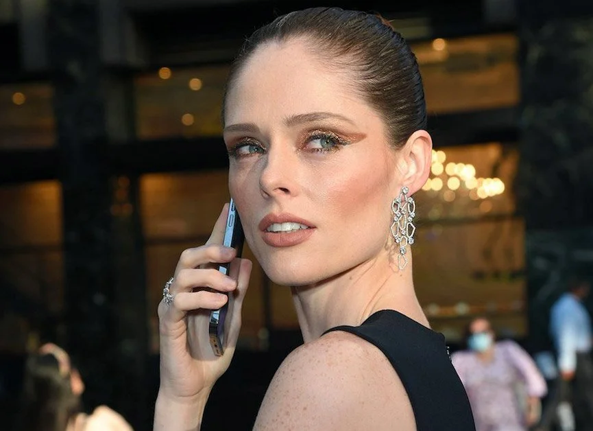
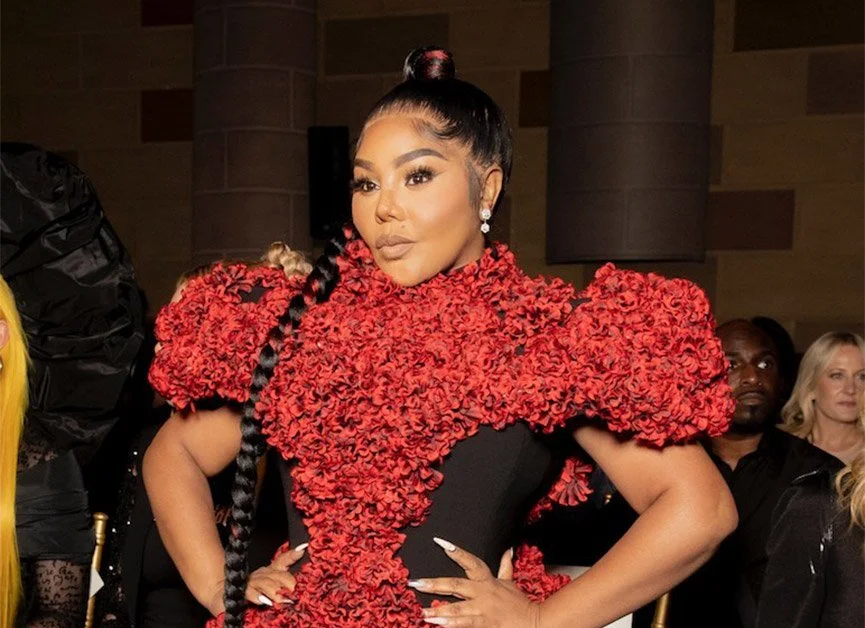
Luminous Diamonds went on to receive significant fashion and media exposure, appearing in major magazines and on red carpets worn by Jennifer Lopez, Katie Holmes, Lil’ Kim, and Coco Rocha.
Designer Christian Siriano also featured Luminous Diamonds in his New York Fashion Week collections for two consecutive years.
-
Creative Director
Art Director / Designer

Digital / Film / Animation
BROWN-FORMAN ASIA
THE BRAND
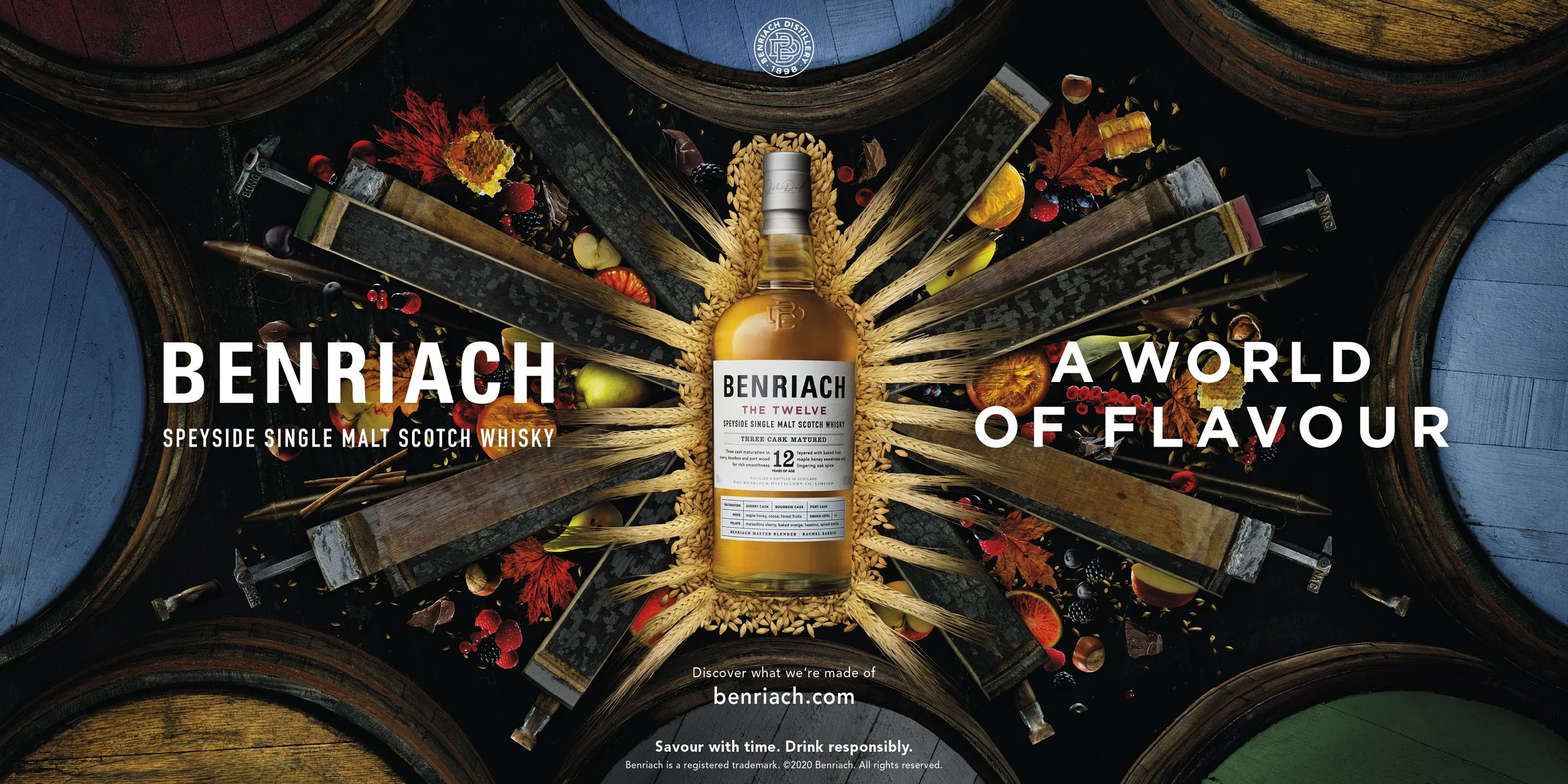
Brown-Forman is one of the world's leading spirits and wine companies, with a portfolio of globally recognized brands including Jack Daniel's, Woodford Reserve, GlenDronach, BenRiach, Herradura, and Chambord.
THE PROJECT
In 2025, I partnered with Brown-Forman's Asia team as Creative Director, developing a range of creative work across the region.
Working across multiple brands and markets, I led the creative development of animated videos, digital banners, stakeholder presentations, and other visual communication materials designed to support regional initiatives and new business opportunities.
The work was not only used for external communication and promotion, but also internally — helping regional teams present new initiatives, build stakeholder support, and secure increased budgets for upcoming campaigns and activations.
-
Creative Director
Art Director / Designer

Digital / Brand Identity
PACT CAPITAL NEW YORK
THE BRAND
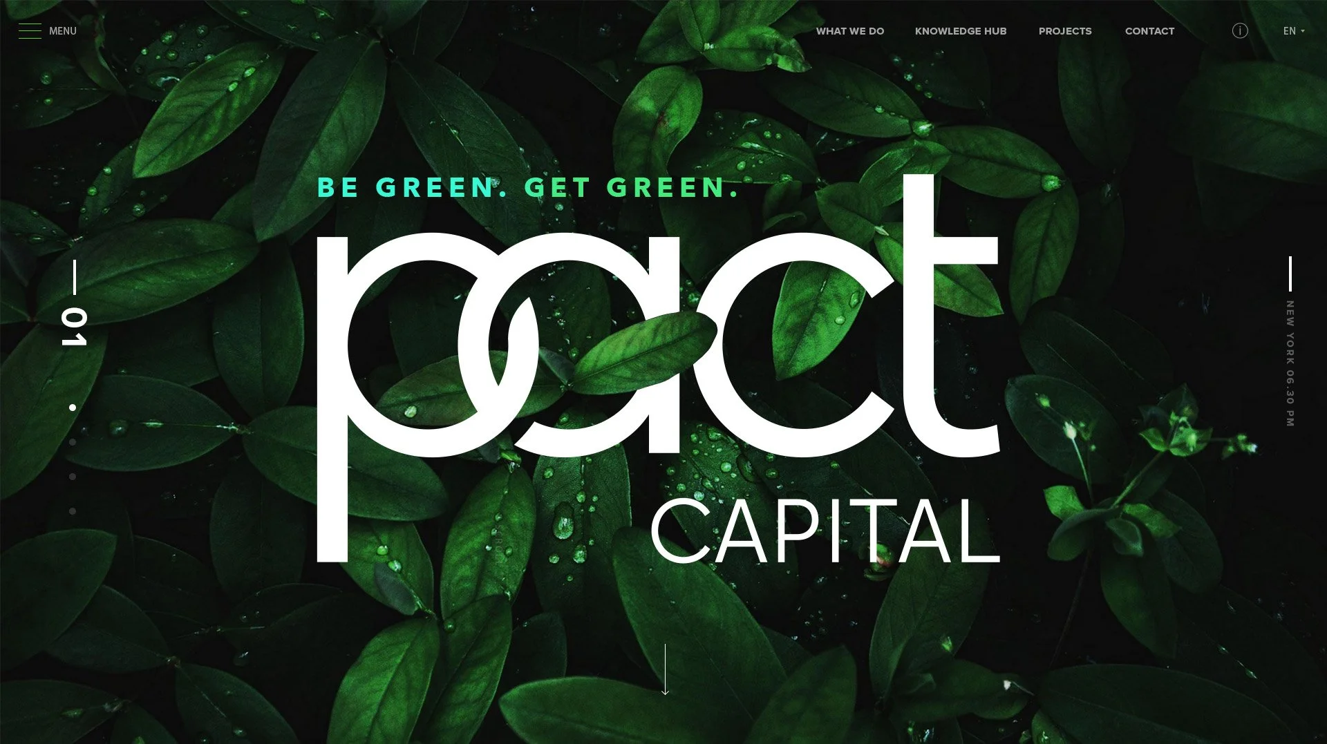
Pact Capital is a New York-based climate finance company helping businesses reduce their carbon footprint and accelerate the transition to a net-zero economy — moving beyond climate neutrality toward positive climate impact.
THE CHALLENGE
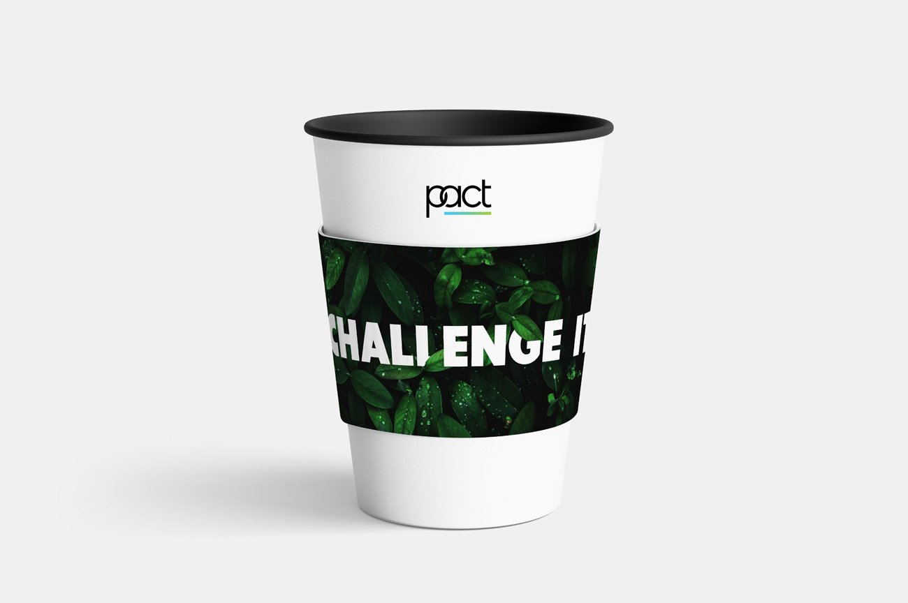
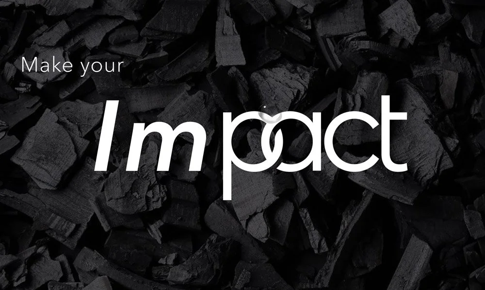
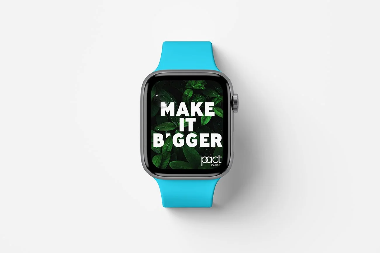
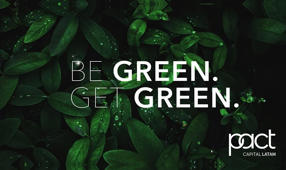
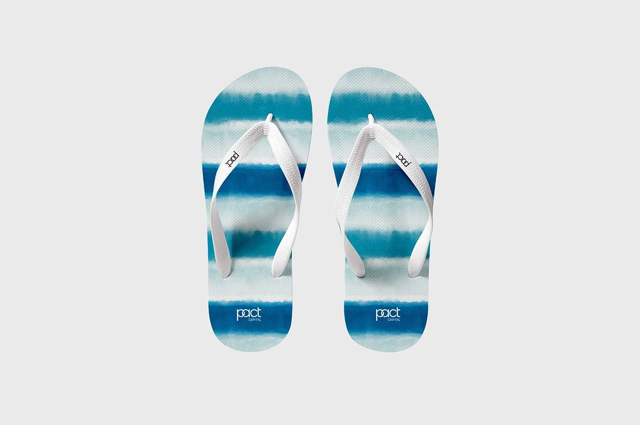
In 2025, I was commissioned by Pact Capital to refresh the brand's visual identity and translate its positioning into a more contemporary, innovative, and distinctive brand experience. The project focused on redefining the visual language and applying the new identity across the company's digital presence, including the design of a new website.
THE APPROACH
The creative direction was built around four principles established in Pact Capital's brand platform: Direct, Simple, Trustful, and Educative.
I translated these principles into a visual system designed to make a complex climate and finance proposition feel clear, credible, and accessible, while giving the brand a more progressive and distinctive character.
THE SOLUTION
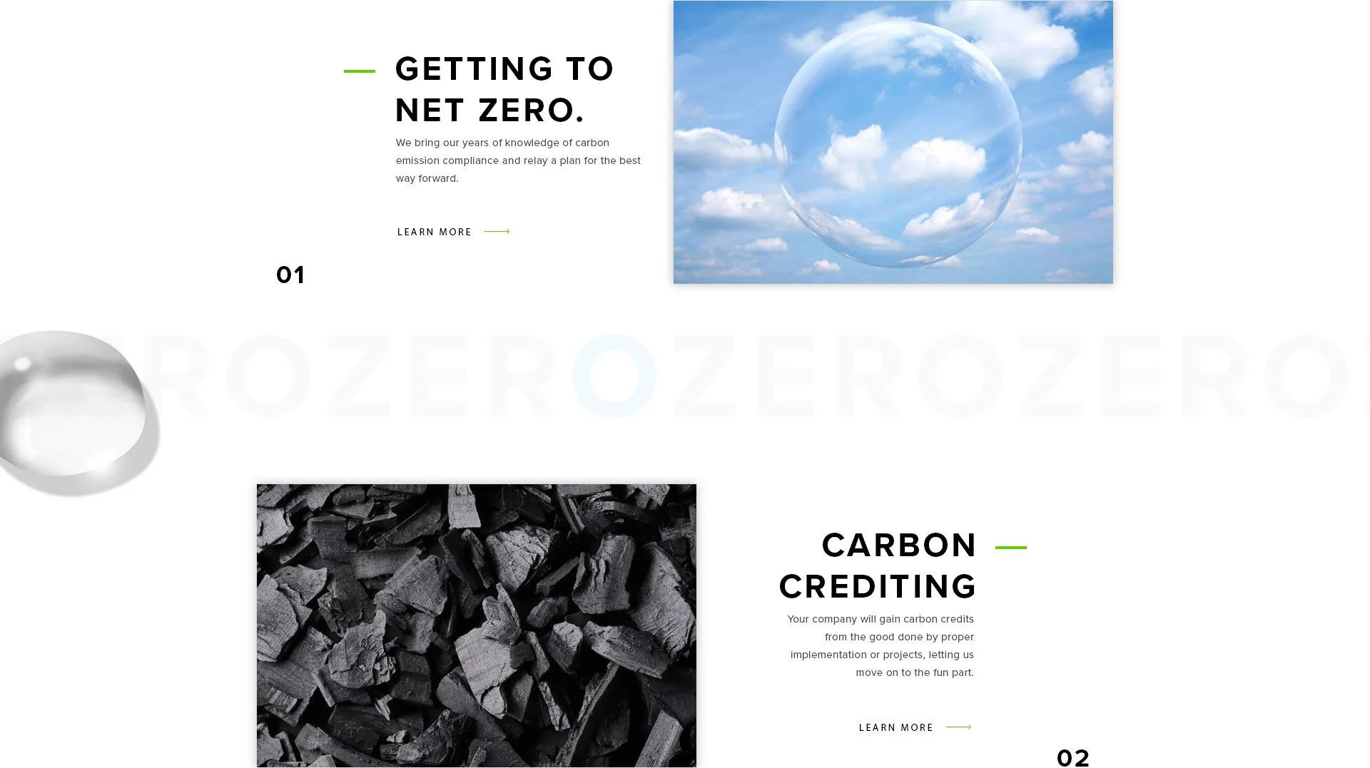
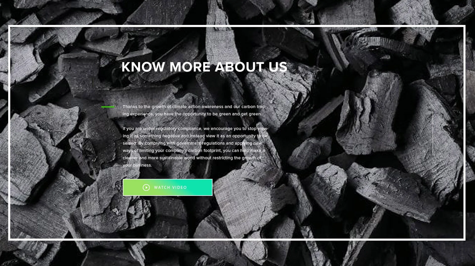
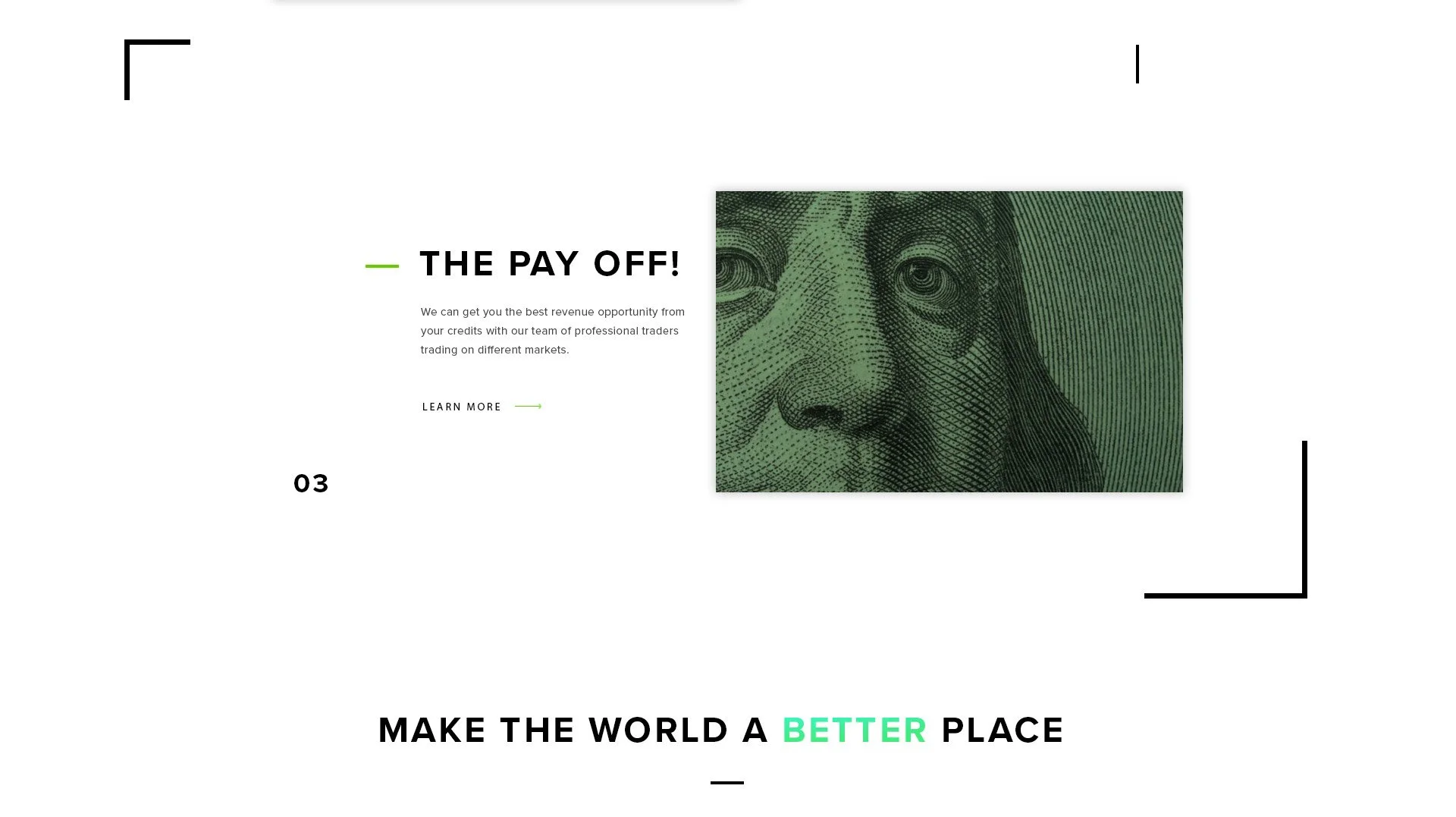
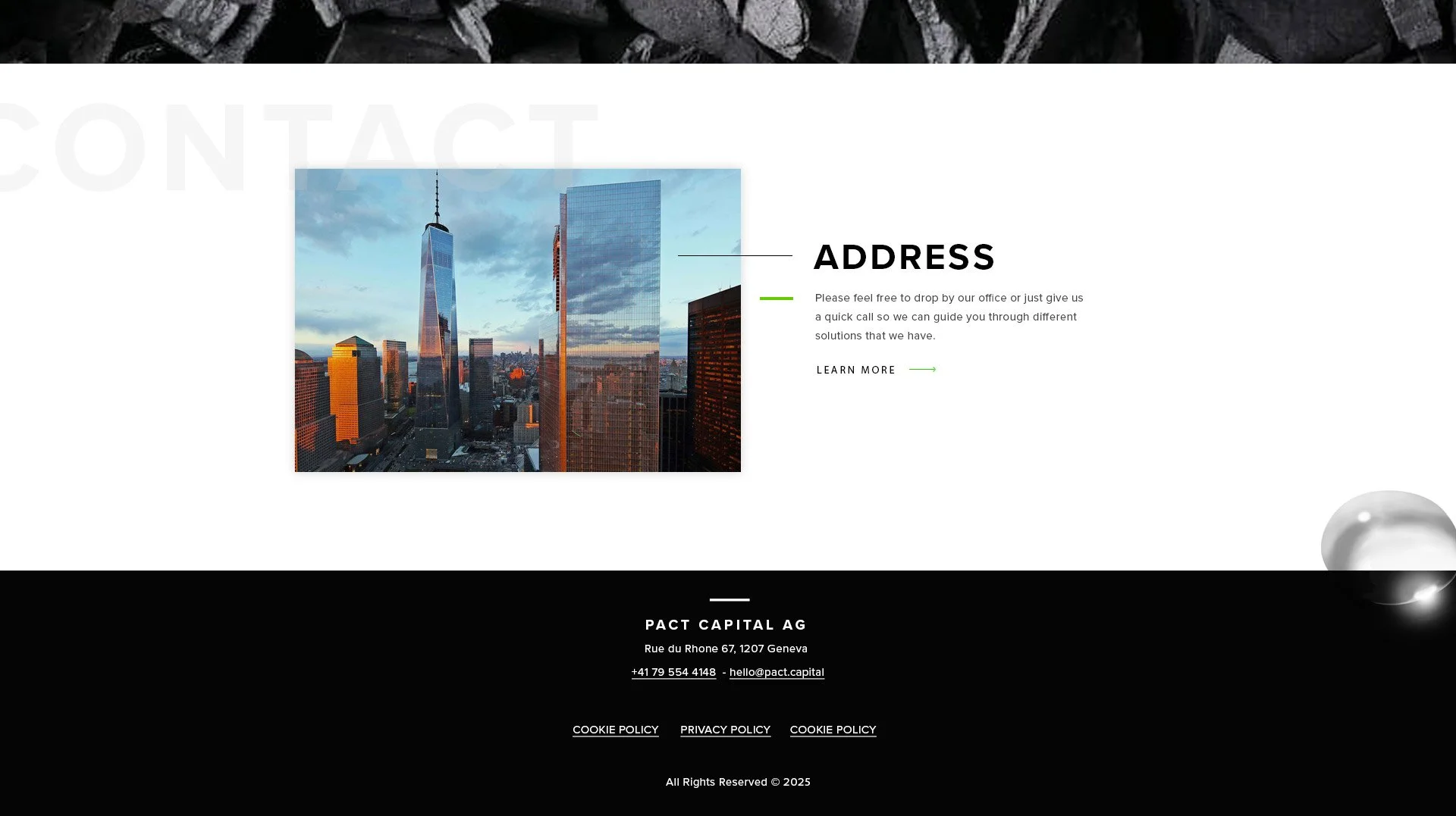
The new identity combines bold typography, generous white space, strong visual hierarchy, and 3D elements to create a flexible visual language that works across digital and offline applications.
For the new website, the system was used to structure complex information into a clear and intuitive experience, while 3D imagery added depth and helped make abstract climate and financial concepts more tangible.
The result is a more contemporary and cohesive brand presence that balances clarity and credibility with innovation — positioning Pact Capital for its next stage of growth.
-
Creative Director
Art Director / Designer
WebGL Website
AHMAD TEA HOLIDAYS
THE PROJECT
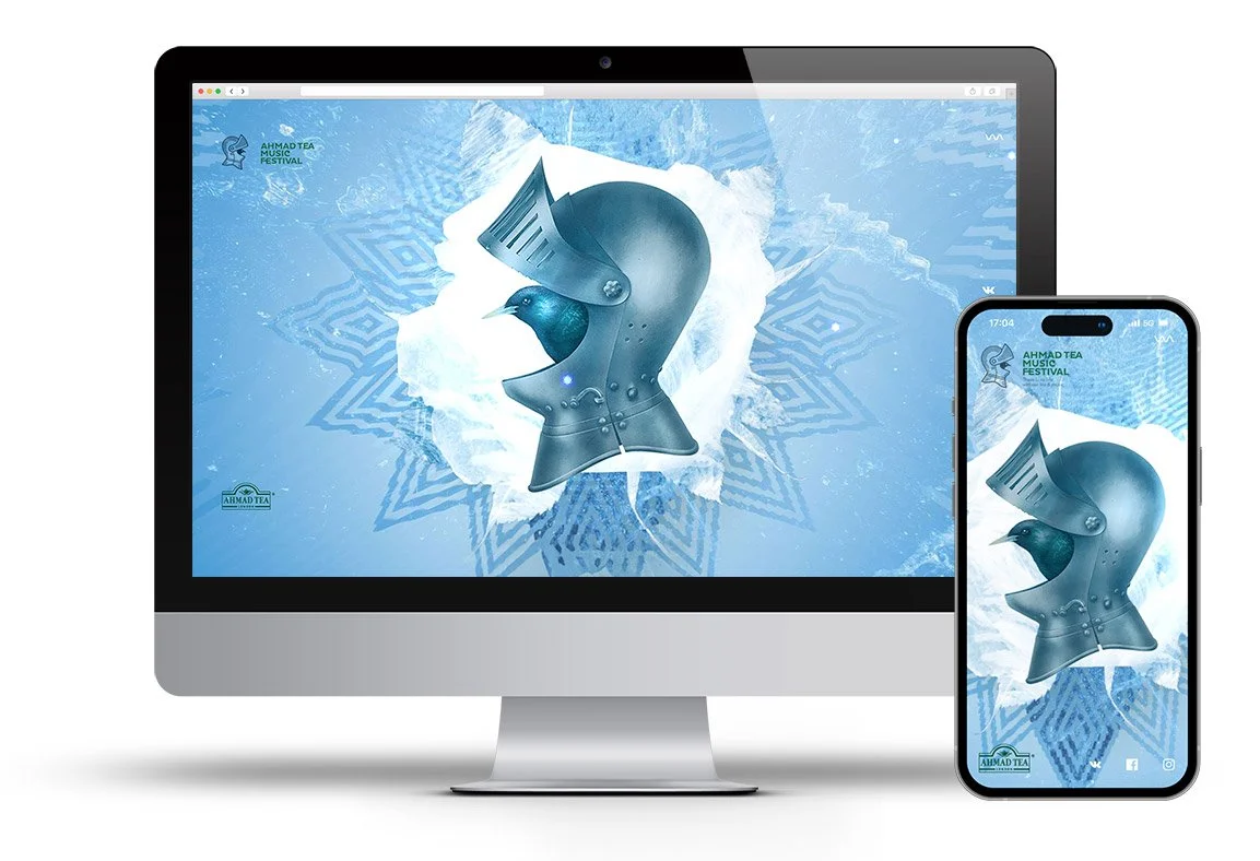
While updating the main Ahmad Tea Music Festival website over the Christmas and New Year period, I developed a dynamic micro-landing page using WebGL. Rather than treating the seasonal period as a simple content update, the idea was to create an interactive digital experience that brought a more engaging and unexpected layer to the festival's online presence.
THE RESULT
Despite the holiday season, the website saw a 19% increase in daily traffic following the launch.
The project demonstrated how a focused interactive experience could generate additional attention and traffic around an existing digital platform.
-
Creative Director
Art Director / Designer
Social / Brand identity / Animation
P·L·A·Y
THE BRAND
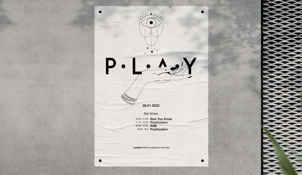
PLAY is a private, high-end party brand created around techno, electronic music, and immersive visual experiences.
The brand produces intimate, invitation-only events in unconventional locations — from theatres and museums to cultural spaces — transforming each venue into a curated audio-visual environment.
Working with internationally recognized DJs, PLAY brings together music, architecture, lighting, and visual storytelling to create a distinctive experience for a close community of like-minded people.
THE PROJECT
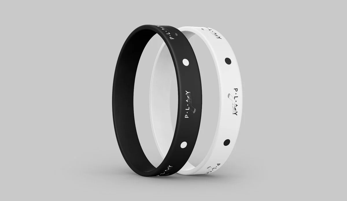
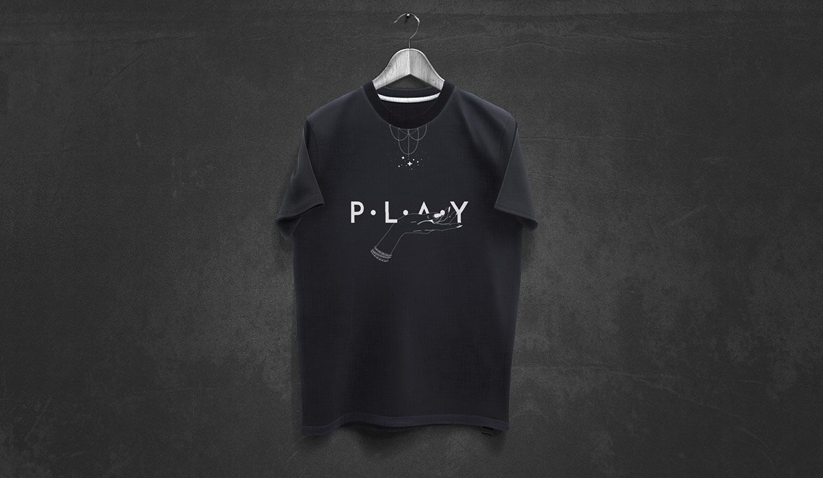
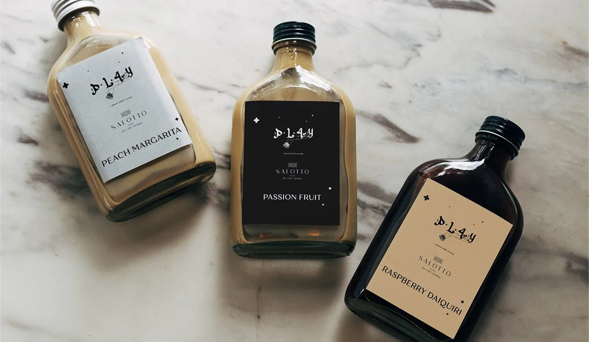
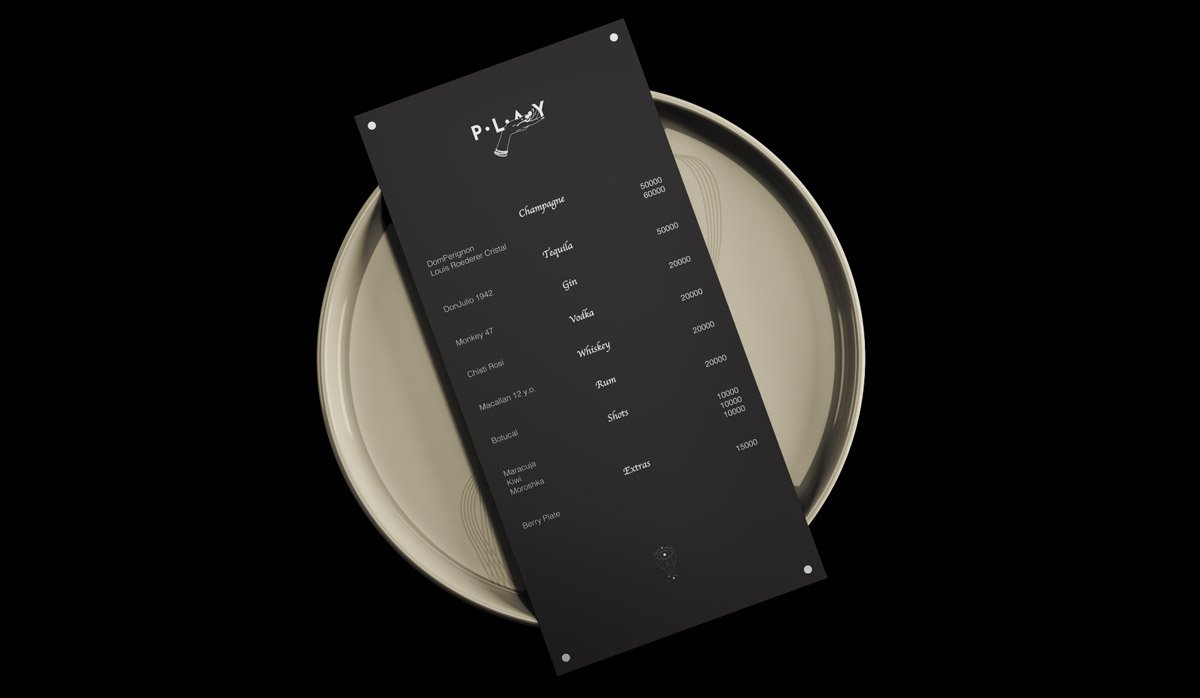
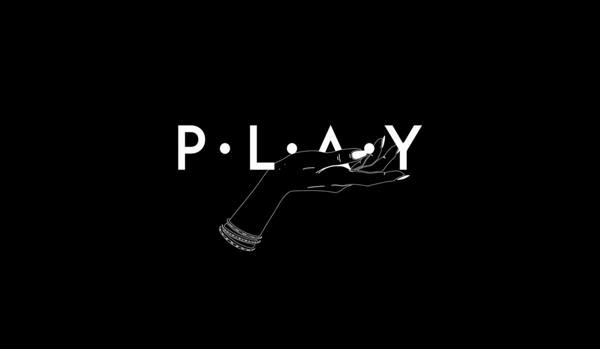
I developed the complete visual identity for PLAY, spanning the logo, typography, social media, promotional assets, and video content.
The creative direction was built around the idea of controlled exclusivity — creating a visual language that felt minimal, sophisticated, and distinctive while leaving enough space for each event and location to develop its own atmosphere.
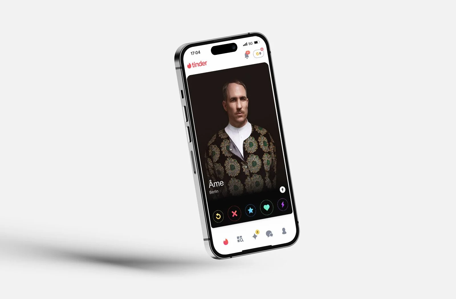
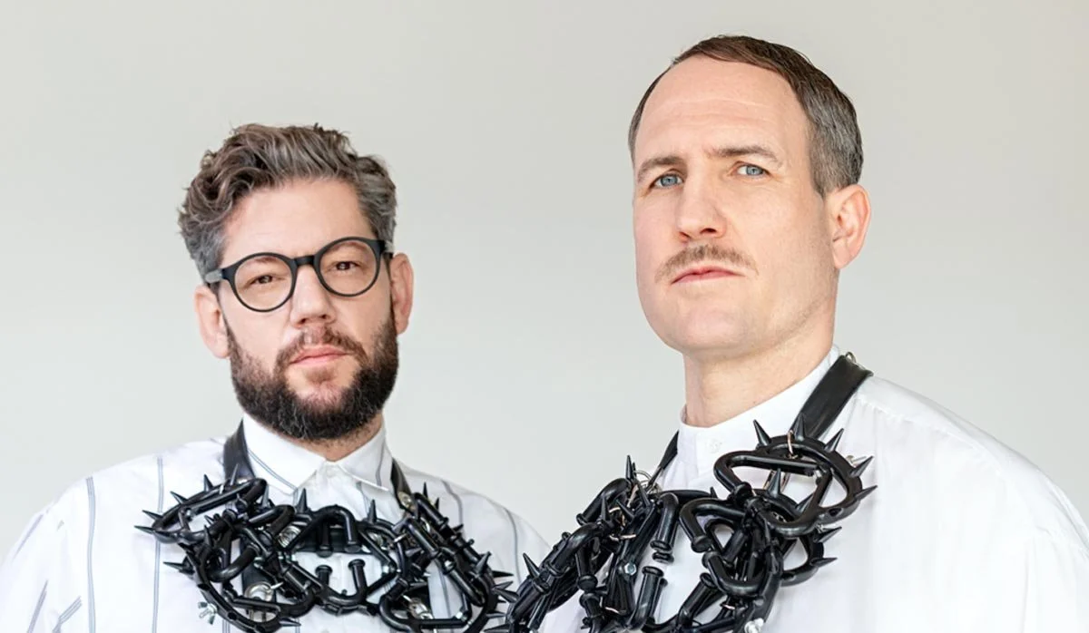
One of the key campaigns promoted a PLAY event featuring Âme, the Berlin-based electronic music duo Kristian Beyer and Frank Wiedemann.
THE PROJECT
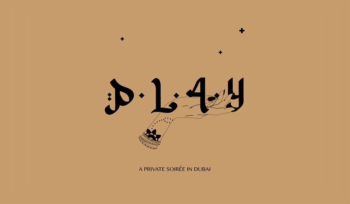
For the PLAY event series in Dubai, I reworked the original PLAY logo and developed a custom Arabic version of the identity.
Rather than creating a literal translation, the Arabic mark was designed as an integral part of the visual system, adapting the identity to its cultural context while preserving the brand's minimal, premium character.
The result was a flexible identity capable of moving between different cities, languages, venues, and cultural environments without losing its core personality.
-
Creative Director
Art Director / Designer
Website / Corporate identity / Logo
MANGOBAY NEW YORK
THE BRAND
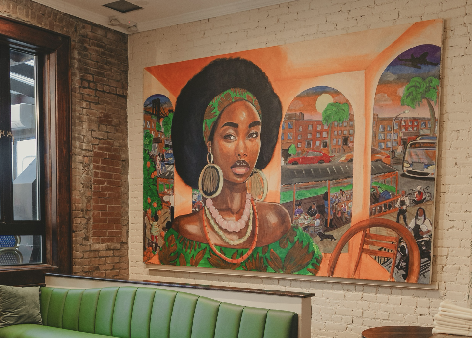
Mango Bay is a Caribbean restaurant rooted in the culture and heritage of its founder and Executive Chef, London Chase. Based in Brooklyn, the restaurant brings the flavors, energy, and visual richness of the Caribbean into a contemporary New York setting, combining Afro-Caribbean cuisine with an immersive interior and hospitality experience.
THE CHALLENGE
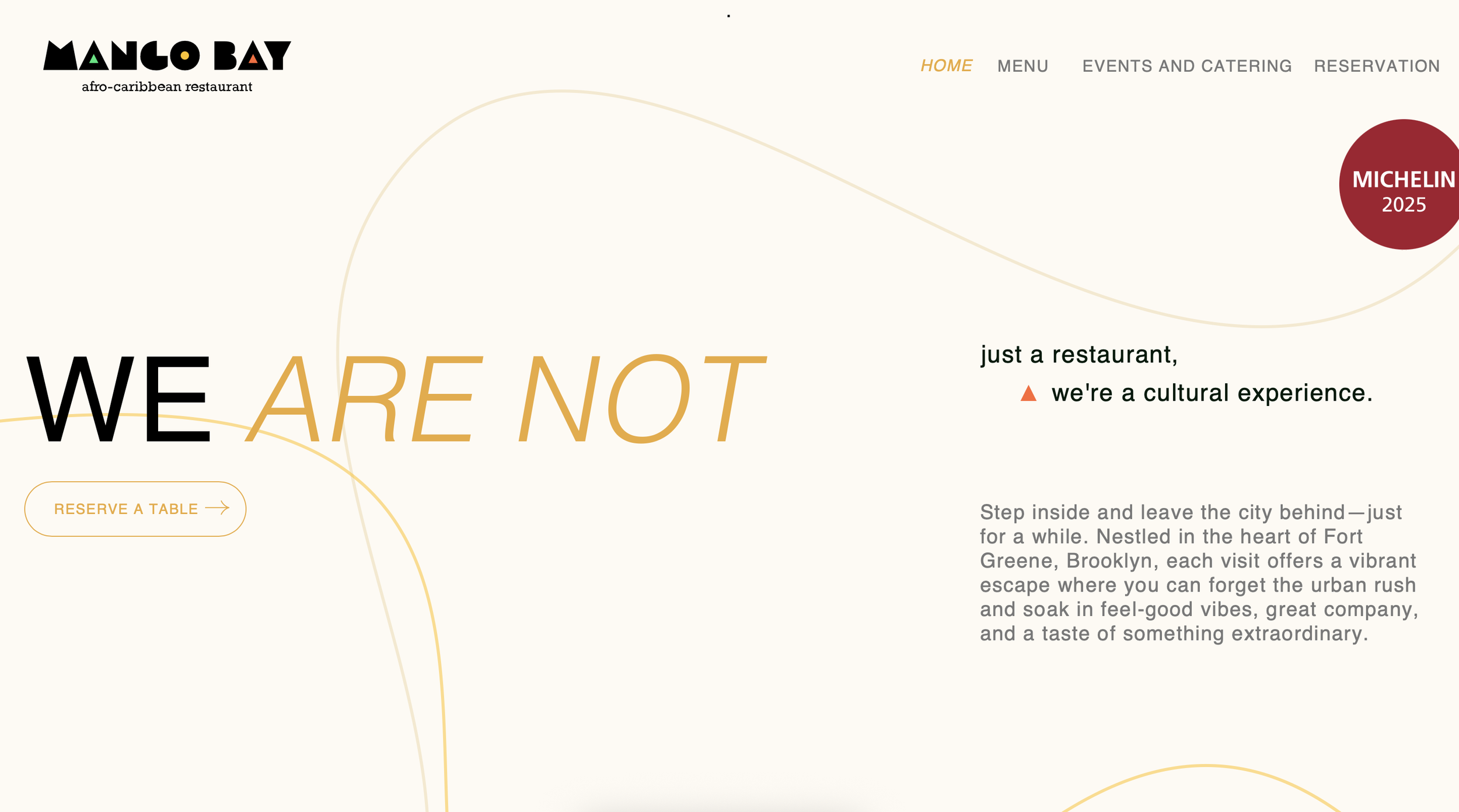
For the launch of Mango Bay's new Manhattan location, I was commissioned to develop the brand identity and digital experience, from the logo and visual language to the website.
The challenge was to create a distinctive identity that felt authentically connected to Afro-Caribbean culture without falling into predictable visual clichés.
THE APPROACH
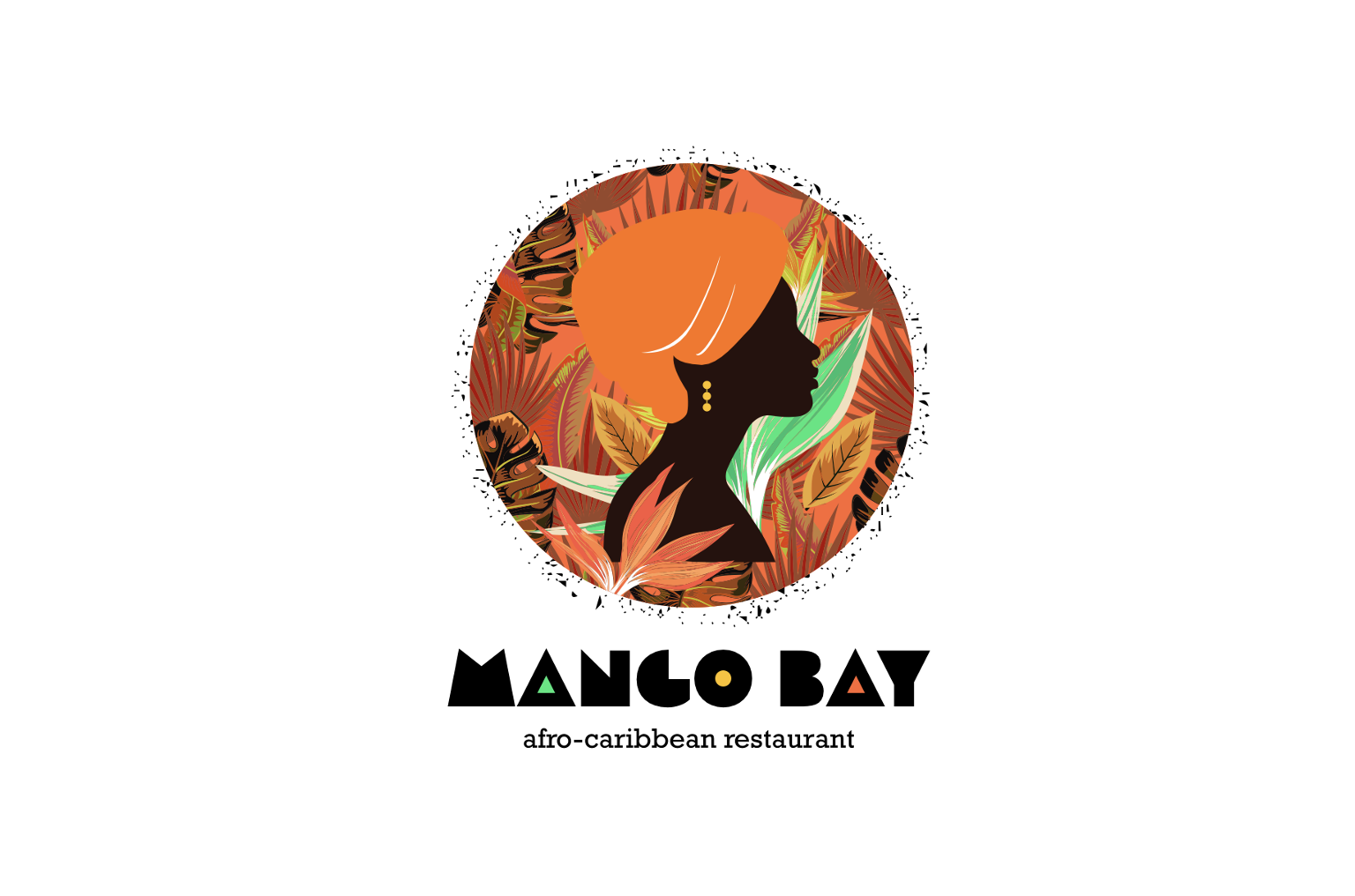
I explored Afro-Caribbean history, traditional patterns, cultural references, and symbolism, using these elements as the foundation for a contemporary visual language.
The research informed the development of the logo, typography, graphic system, and broader brand identity, creating a visual world that connected cultural heritage with a modern New York sensibility.
THE DIGITAL EXPERIENCE
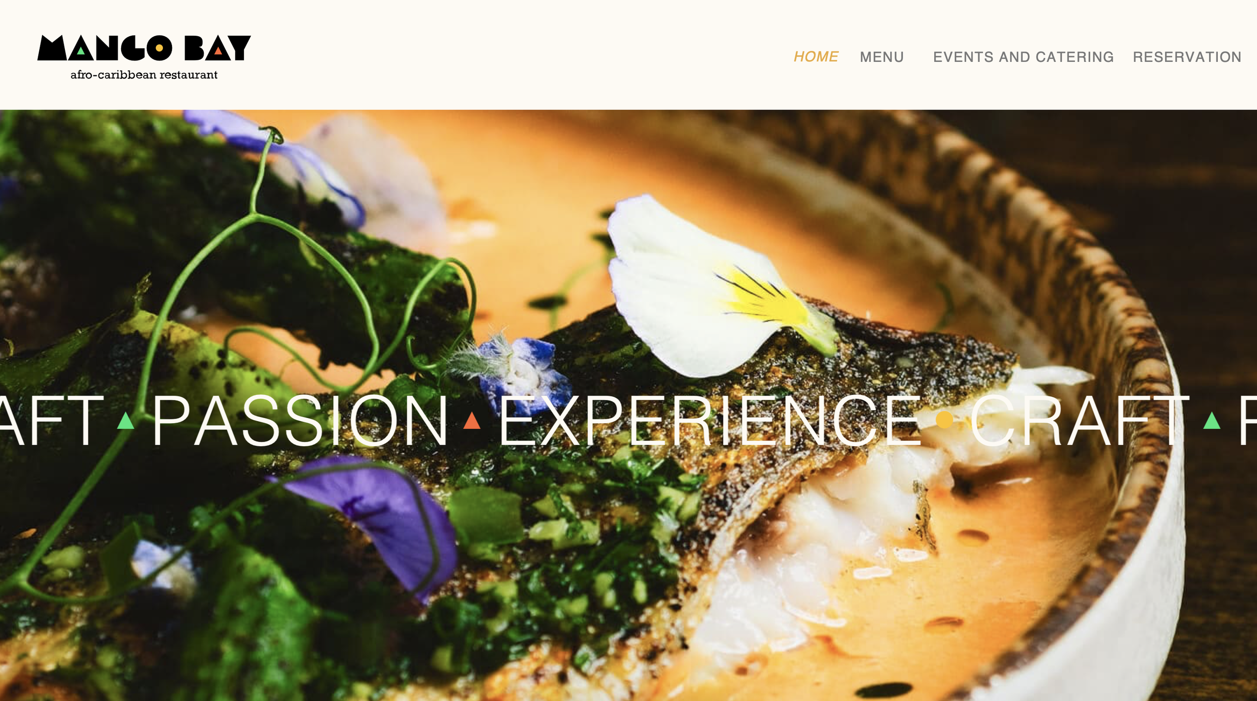
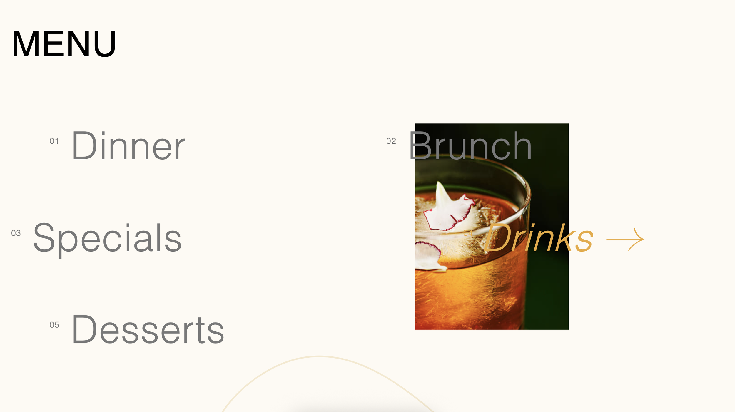
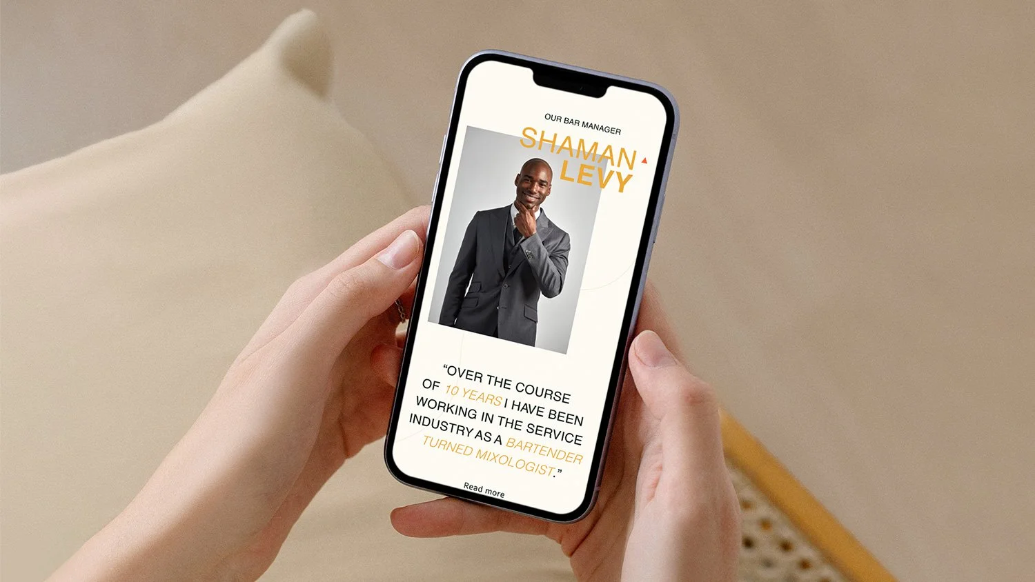
The identity was carried through into the website, where refined animation, motion, and micro-interactions were used to bring the brand to life. Rather than simply presenting the restaurant, the digital experience was designed to evoke the rhythm, warmth, and energy of the Caribbean, while keeping the navigation and information clear and intuitive.
THE RESULT
Within five months of launch, the restaurant was fully booked.
Ten months after launch, Mango Bay received recognition in the Michelin Guide, establishing the restaurant as a notable new presence in New York's competitive dining scene.
-
Creative Director
Art Director / Designer
WebGL website
XMAS CARD
THE IDEA
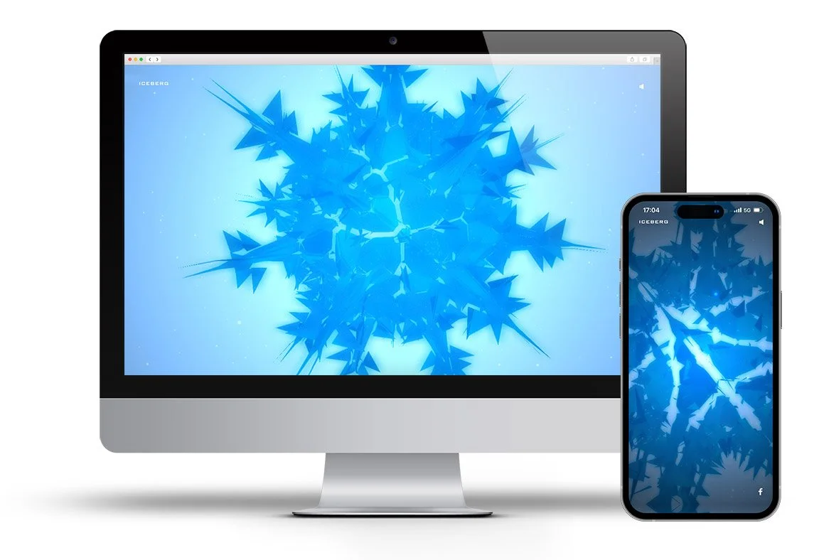
Ahead of the New Year holidays, I wanted to create something unexpected for my clients — not another seasonal greeting, but a digital experience that would genuinely surprise and engage them.
I developed a one-of-a-kind interactive website using WebGL, combining experimental visual design with real-time 3D technology to create an immersive experience.
The project was designed as both a creative experiment and a statement of intent: showing how emerging technology could be used to create memorable digital experiences beyond conventional websites and campaigns.
THE RESULT
The experience received strong recognition from industry peers and went on to win multiple international digital awards.
More importantly, it generated direct business impact, leading to three new holiday projects from existing clients.
-
Creative Director
Art Director
UX/UI development for the world’s largest diamond producer
Oh!DIAMOND
THE PROJECT
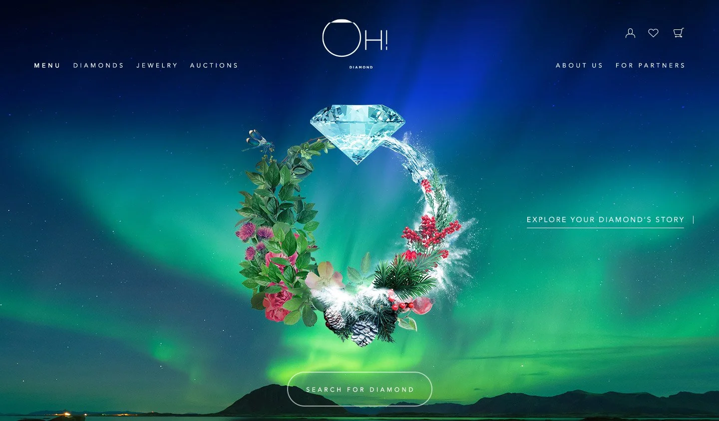
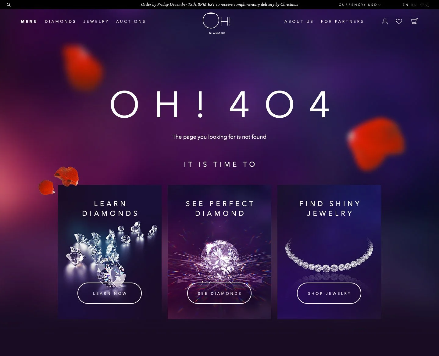
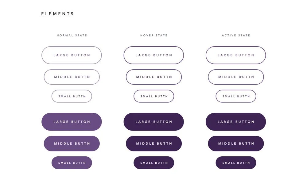
I was involved in the design and creative direction of ALROSA's first e-commerce platform, bringing the company's diamond collection into a fully digital retail experience.
The platform was designed to showcase the full range of diamonds while making the purchasing process more transparent, flexible, and engaging.
THE EXPERIENCE
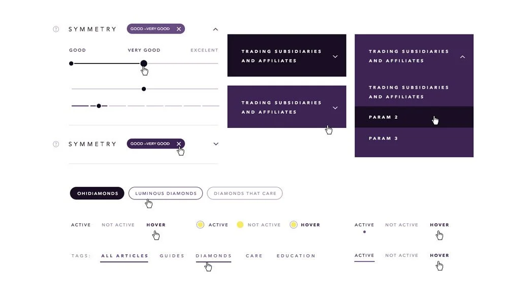
The platform combined e-commerce, product discovery, education, and interactive visualization in a single digital experience.
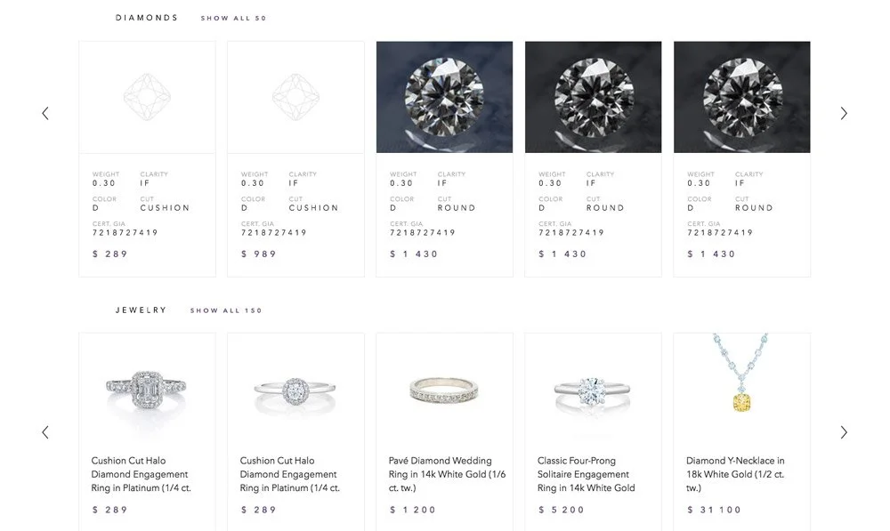
Customers could explore diamonds through advanced search, filtering, and sorting, access detailed information about each stone, and purchase diamonds directly online — including made-to-order pieces and products listed through auctions.
The platform also supported multiple currencies and integrated payment processing and transaction management, creating a complete digital purchasing journey.
MAKING THE INVISIBLE VISIBLE
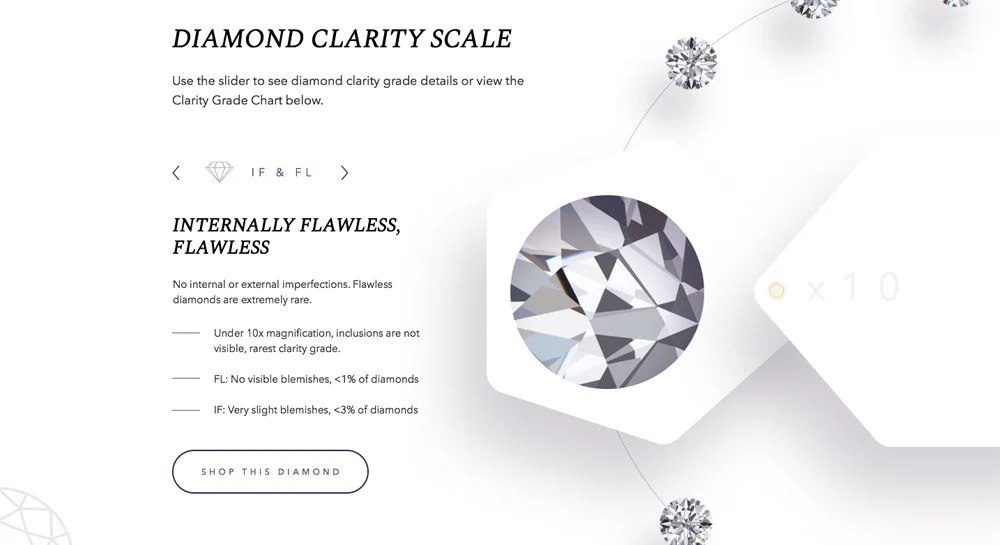
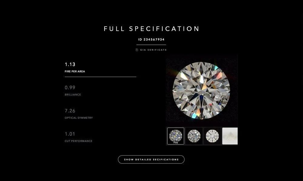
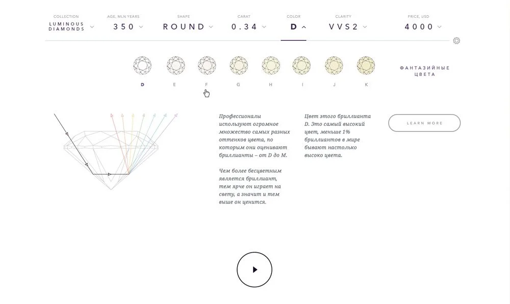
One of the key challenges was communicating the technical characteristics of a diamond in a way that felt accessible and visually engaging.
For each gemstone, we developed custom-generated infographics that translated its specifications and clarity characteristics into an intuitive visual format.
The experience was further enhanced through interactive 3D diamond models, allowing users to zoom, rotate, rewind, and manipulate individual stones in real time.
The result was an e-commerce experience that treated diamonds not simply as products, but as objects to explore, understand, and experience digitally.
-
Creative Director
Art Director / Designer
Brand identity, logo restyling
ICE KREAM HASH Co.
THE BRAND
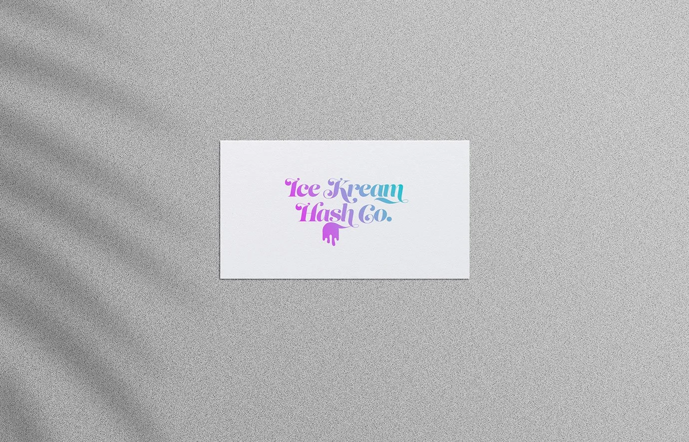
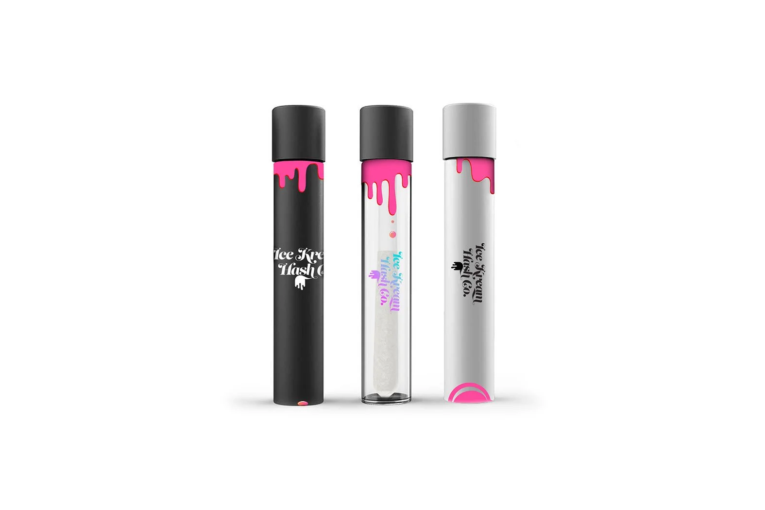
Ice Kream Hash Co. is a Michigan-based cannabis brand specializing in solventless live rosin, hash-infused pre-rolls, and vapes. Founded by veteran growers and hash makers, the brand is built around small-batch production, craft, and quality.
THE CHALLENGE
I was commissioned to refresh the visual identity of Ice Kream Hash Co., giving the brand a stronger and more distinctive visual presence while preserving its existing personality and recognition. The goal was to move the brand beyond conventional cannabis aesthetics and create an identity that could feel equally at home across product packaging, fashion, street culture, and lifestyle.
THE APPROACH
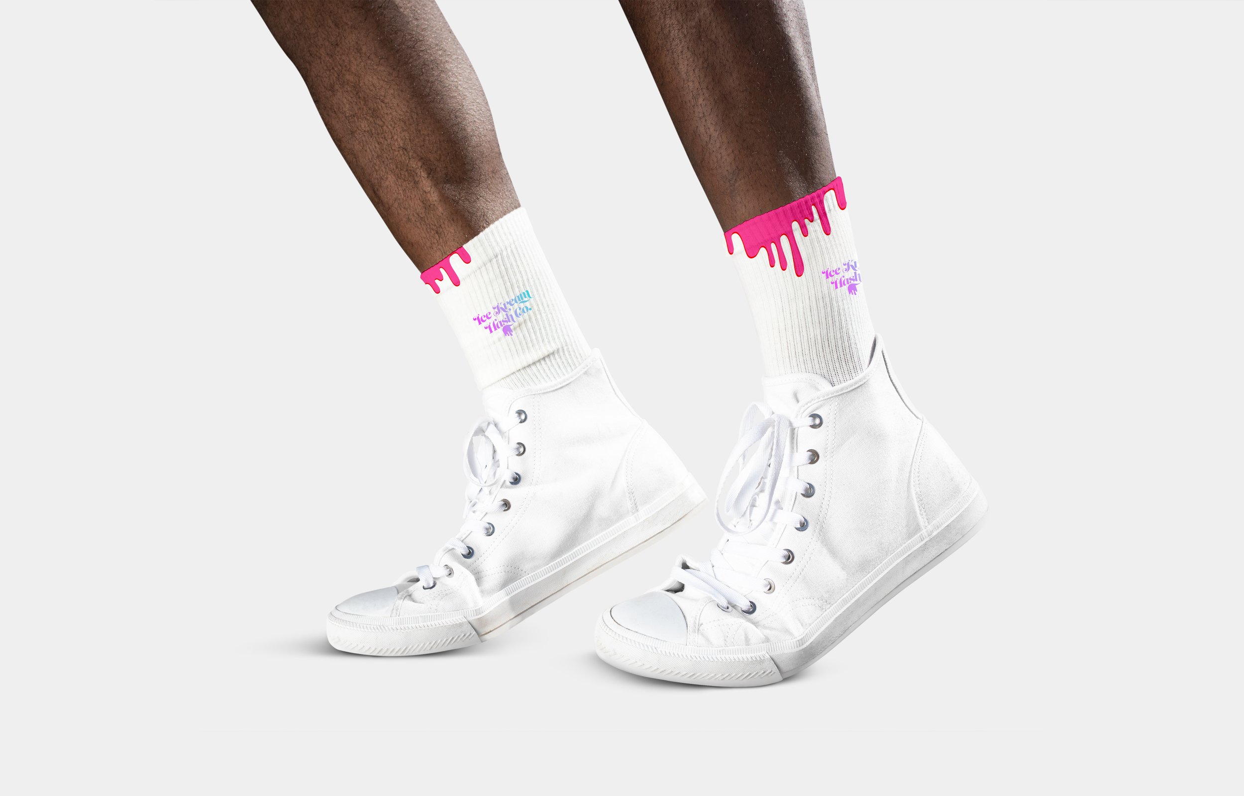
The restyling centered around the idea of “melting” — turning the name Ice Kream into a visual language.
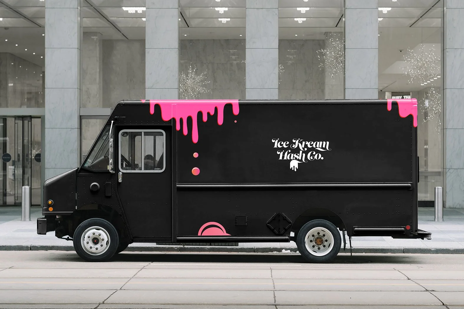
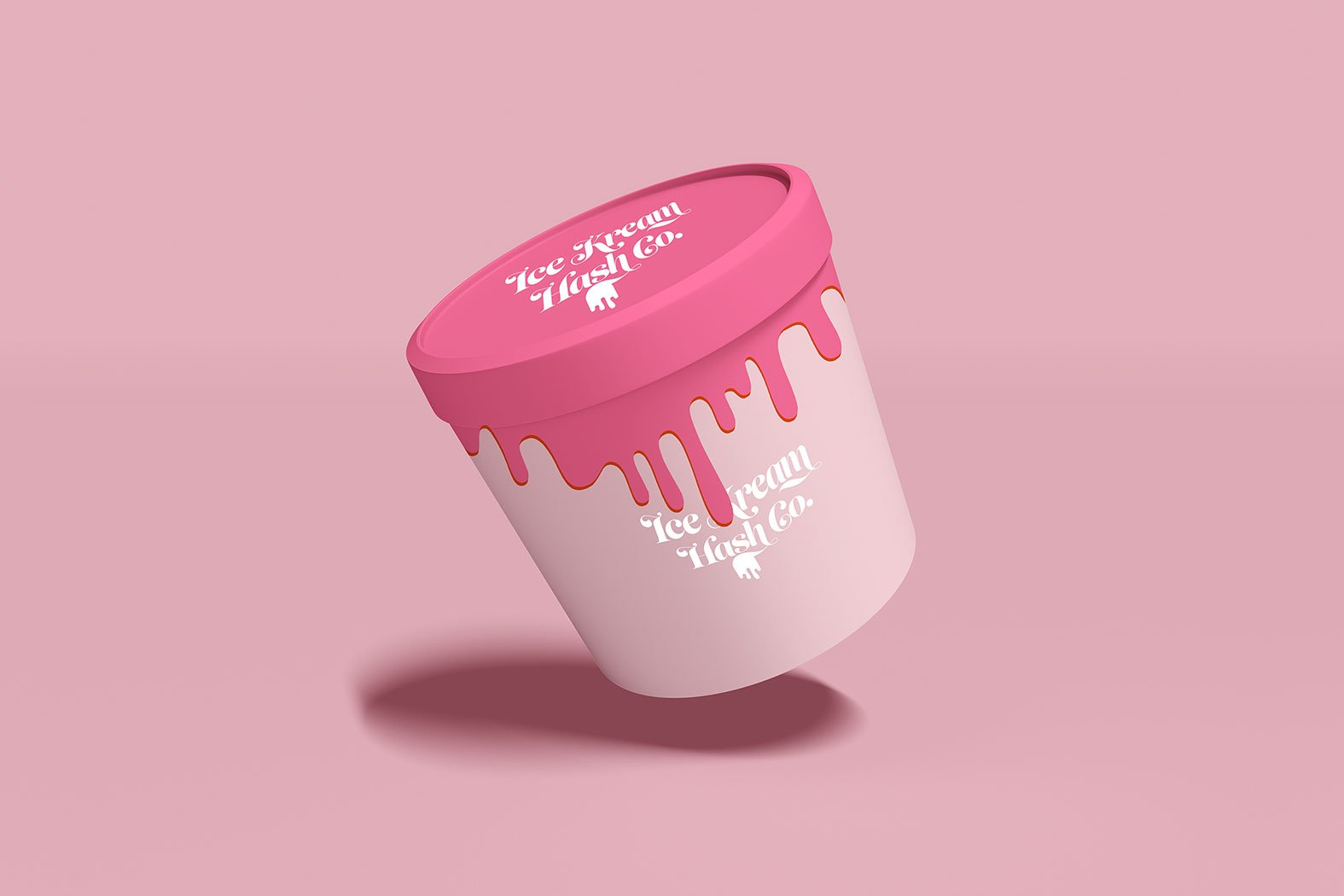
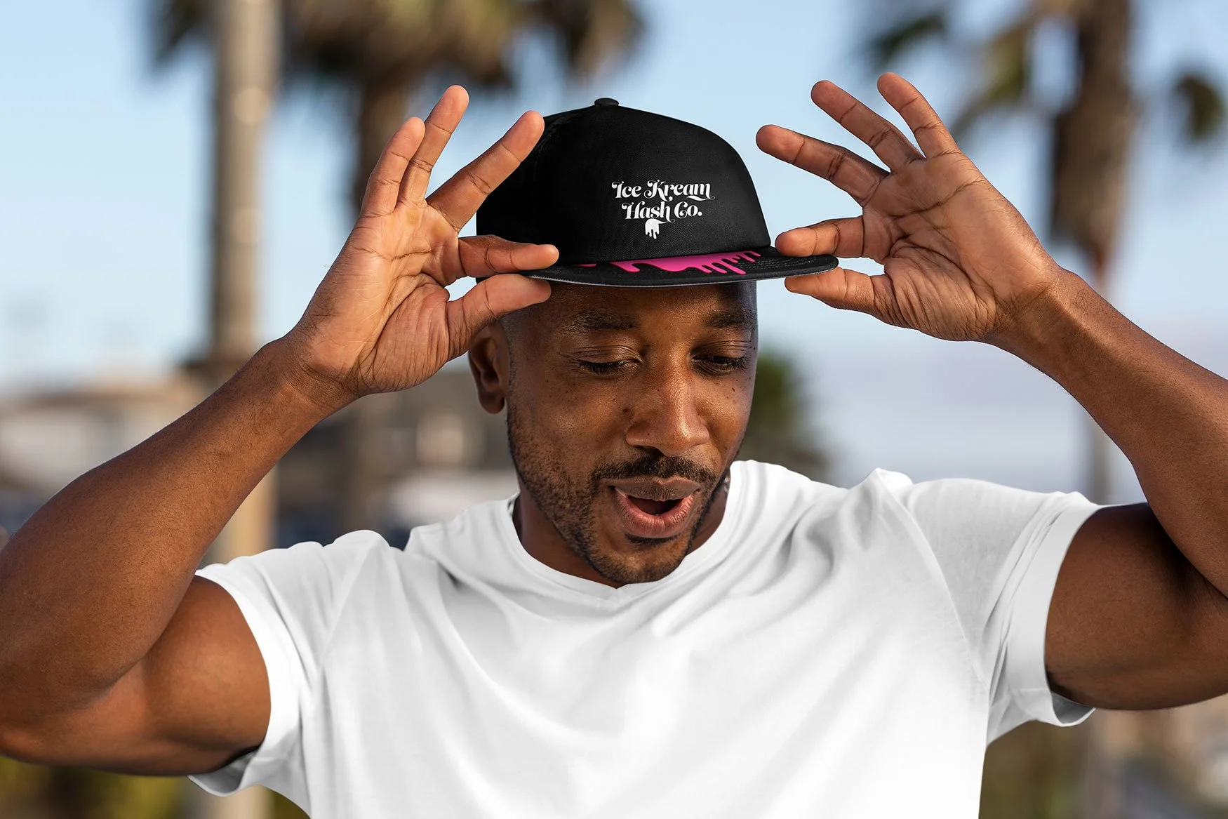
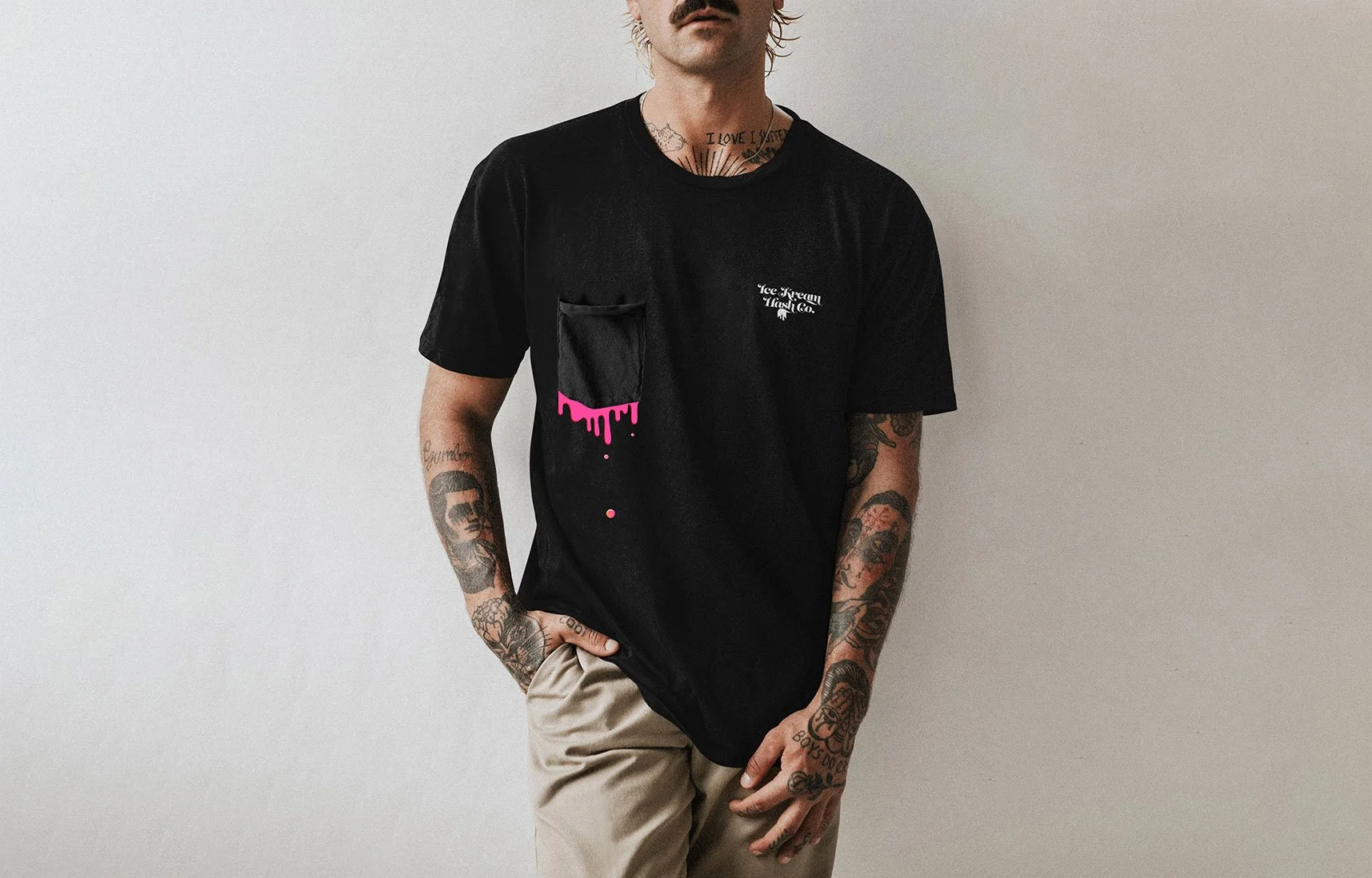
I developed a distinctive dripping graphic device that became an extension of the logo, appearing across packaging, apparel, vehicles, accessories, and digital applications. The melting forms create a playful contrast with the otherwise clean and minimal compositions.
A deliberately restrained palette of black, white, hot pink, and lavender gives the identity a contemporary, fashion-forward character while allowing the logo and graphic elements to remain highly recognizable.
The system was designed to be flexible enough to work across very different contexts — from product tubes and containers to T-shirts, caps, delivery vehicles, and campaign imagery.
THE RESULT
The refreshed identity gives Ice Kream Hash Co. a more cohesive and ownable visual language, transforming the brand from a product-focused cannabis label into a distinctive lifestyle identity with a strong presence across physical and cultural touchpoints.
-
Creative Director
Art Director
Integrated
BEARD SHOW
THE CHALLENGE
NIVEA MEN wanted to increase usage of its shaving range among young men at a time when beards were becoming increasingly fashionable.
The challenge was to make shaving feel relevant and contemporary again — without simply telling young men that they should shave.
THE IDEA
What if we made the beard the problem?
As Creative & Art Director, I led an interactive digital campaign that turned the inconveniences and absurdities of having a beard into entertainment.
Five participants, selected through street casting, were challenged to confront the downsides of their beards while competing for a Harley-Davidson.
The campaign launched alongside a global NIVEA MEN TV commercial, but the digital experience took the idea further: when a participant was eliminated, they had to be shaved using an unconventional object — ice skates, scissors, a spoon, or an axe.
The twist? The audience chose the shaving tool.
This turned the campaign from a passive advertising experience into an interactive game, giving viewers a direct role in what happened next.
RESULTS
The campaign received strong recognition from Beiersdorf's headquarters in Hamburg and generated significant audience participation:
64,000 registered users
652,000 video views
3.46 min average watch time
-
Creative Director / Art Director
Facebook Game
SMART
FORTWO
THE CHALLENGE
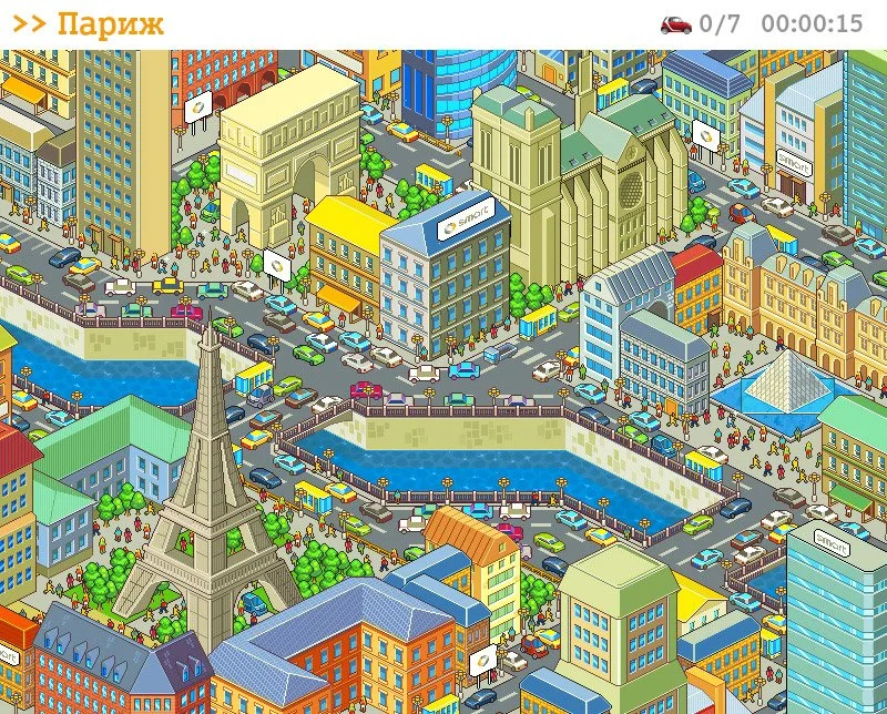
The smart fortwo was designed around one fundamental advantage: urban mobility. At just 2.69 metres long, it could fit into parking spaces that were inaccessible to larger cars.
The challenge was to turn this functional benefit into an engaging digital experience — and demonstrate just how much easier it was to park a smart in the world's most congested cities.
THE IDEA
Find the Smart.
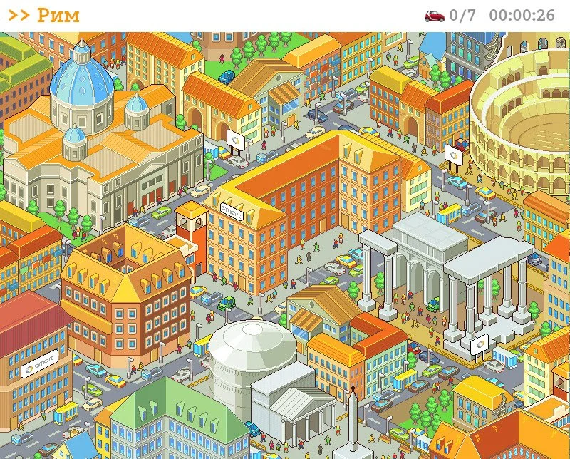
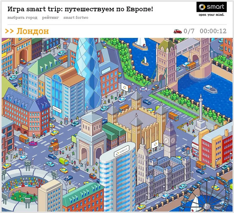
I created an interactive Facebook game that turned the car's compact size into the central mechanic of the experience.
Users were invited to search for hidden smart fortwo cars parked within detailed city scenes based on some of Europe's most congested cities — London, Rome, Berlin, Paris, and Moscow.
The simple premise made the product benefit tangible: if you could find the smart where other cars couldn't fit, you understood why it was made for the city.
THE RESULT
5 MINUTES average time spent playing
1,000+ users completed the challenge
20% shared their results
-
Creative Director
Art Director / Designer
Over the years, I’ve led 100+ projects across digital experiences, integrated campaigns, brand identities, and creative direction.
This is a selection of my work.
If you’d like to see more, let’s talk.
OTHER CASES